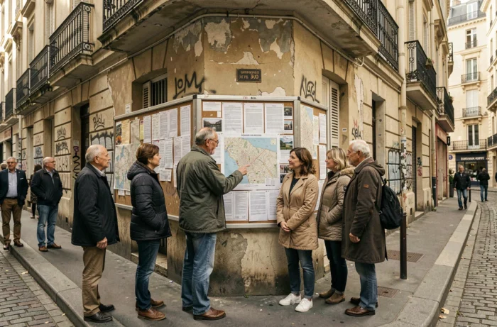
The priority neighborhoods of urban policy (QPV) encompass approximately 5.3 million inhabitants in mainland France, which represents nearly 8% of the population according to Insee. Mapping urban tensions requires understanding how these territories are defined, what data feeds the visualization tools, and what these maps truly allow us to read.
Priority Geography 2024: The Cartographic Base That Conditions Everything Else
Before consulting a tension map, one must know what geography it is based on. The boundaries of the QPV were updated on January 1, 2024 by the ANCT and departmental prefectures, based on data from Insee. This update redraws the outlines of hundreds of neighborhoods in metropolitan France.
This update is not cosmetic. The location of an address in a QPV conditions access to public programs: tax exemptions, social aid, urban renewal programs. A neighborhood that falls outside the perimeter loses these levers, even if its residents continue to face the same difficulties.
The SIG Ville platform, managed by the ANCT, allows you to check if an address is located in a QPV. It provides access to the territorial profiles of each neighborhood, with social indicators gradually updated based on this new geography. To consult the map of hot neighborhoods on Essentium, these perimeters serve as a foundation for locating tension areas.
Crime Data and Interactive Mapping: What the Maps Really Show
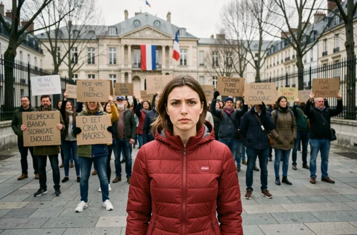
The interactive crime maps in France primarily utilize statistics from the Ministry of the Interior, published annually by the Ministerial Statistical Service for Internal Security (SSMSI). These data cover incidents reported by the police and gendarmerie, broken down by department or municipality.
Paris consistently appears as the department most affected in terms of raw volume. Lozère is among the least affected territories. These results, often reproduced as they are in online visualizations, need to be related to the resident population to make sense.
The rate per thousand inhabitants radically changes the ranking compared to absolute figures. A densely populated department mechanically concentrates more incidents. Without this weighting, the maps produce a biased reading that overexposes large urban areas and obscures local tensions in medium-sized municipalities.
Limitations of Available Data
Official statistics only account for reported incidents. The reporting rate varies significantly by type of offense: burglaries are widely reported (if only for insurance), while domestic violence is much less so. A crime map thus reflects both the declarative behavior of victims and the reality of tensions.
The data do not always descend to the infra-municipal level. Locating a specific neighborhood on an interactive map remains difficult when the figures are aggregated at the level of the entire municipality. The most refined tools cross-reference several sources:
- SSMSI data by type of incident (property offenses, violence against persons, economic offenses), available by department
- Urban reports collected by certain participatory platforms, which geolocate incidents to the exact address
- Socio-economic indicators from Insee (median incomes, unemployment rates, share of social benefits), linked to QPV
Crossing Insecurity and Social Indicators: The Missing Angle in Classic Maps
Most online maps limit themselves to overlaying crime data on a geographical background. This approach isolates the phenomenon from its context. The QPV concentrate a high proportion of social benefit recipients, and the 2024 data from Insee confirm that the median income there remains significantly lower than the national average.
Integrating the new QPV geography 2024 into educational outcomes opens up a complementary reading. The data on the national diploma of the brevet 2025, produced by Insee in geography as of January 1, 2024, now allow for measuring educational success neighborhood by neighborhood. Cross-referencing these results with security indicators provides a more complete view of the structural tensions in a territory.
Feeling of Insecurity and Objective Data
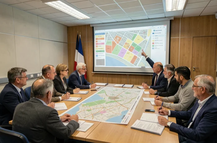
The Quorum Institute distinguishes the feeling of insecurity from recorded crime statistics. The two do not always overlap. Some neighborhoods show moderate rates of reported incidents but a high feeling of insecurity, linked to repeated incivilities, degradation of the living environment, or a deficit of institutional presence.
This distinction matters for interpreting an interactive map. A red color code in a territory may reflect a high volume of reported incidents, a composite index including victimization surveys, or simply a relative ranking between municipalities. Checking the methodology behind each map remains the first precaution before drawing a conclusion about a neighborhood.
Sensitive Urban Zones, QPV, Hot Neighborhoods: Clarifying the Vocabulary of Maps
The term “hot neighborhood” has no administrative definition. It falls under common language and refers, depending on the context, to an area marked by delinquency, social tensions, or simply a media reputation. Institutional maps never use this expression.
Sensitive urban zones (ZUS), created in the 1990s, were replaced by QPV in 2014 with the programming law for the city and urban cohesion. However, some online maps still display the old ZUS boundaries, producing outdated results.
- ZUS: former zoning based on the presence of large housing estates and the housing-employment imbalance, abolished in 2014
- QPV: current zoning based on the sole criterion of residents’ income, updated in 2024
- Hot neighborhood: journalistic expression without an official perimeter, often used in participatory or media cartographies
Confusing these concepts skews the reading of a map. A territory classified as a QPV is not automatically a place of high delinquency. It primarily indicates a concentration of economic precariousness, making it the target of specific public policies.
The mapping of tensions in France becomes more precise each year, but its reliability still depends on the source, the date of the data, and the geographical perimeter chosen. Reading an interactive map without verifying these three parameters is like navigating without a legend.